Have you ever noticed how a single color can shift the mood of a room, spark a memory, or even influence your day? Each year, Pantone announces a “color of the year” that aims to capture the spirit of the times. For 2026, their choice, “Cloud Dancer,” a lofty white, has stirred up a surprising amount of debate. Pantone describes it as “a whisper of tranquility and peace in a noisy world,” hoping to inspire calm reflection in our fast-paced society.
Now many of you could care less what this year’s color of the year is. Or like me, before working in a Marketing and Communication Department, I didn’t even know that there was a color of the year. Trust me, it’s important in the Advertising World. From trend forecasting and psychological impact to marketing emotional connection, the color of the year provides marketers direction in how to design the year’s campaigns, their web site, emails, and social media. All these things help them stay ahead of the curve in a competitive market.
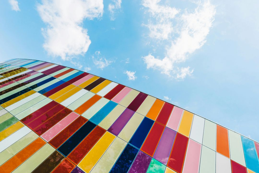
But what does it mean to you and me? For those who like to renovate and re-design their homes on a yearly basis, it gives you the latest trends in colors for everything from wall paints to window treatments, furniture, and cabinetry. For me I started out with all my walls a bright white. I’m generally a happy person and like everything to be bright and joyful. I hate dark colors. I once had what I liked to call an ice cream home. One room was pink like strawberry ice cream, another green like pistachio, and another my favorite, a light purple like black raspberry ice cream. For me “Cloud Dancer” is a might cloudy for me. Give me a stark, bright white if you are going white.
What are the critics saying?
- Underwhelming
- Boring
- Flavorless
- Disturbing
- Dystopian
- Out of Touch
- Bland
- Recession Indicator
- Colorful Cultural Resistance
- Uninspiring
- Missed opportunity for Joy
- Sparkless
On the other hand, what are those who embrace “Cloud Dancer” saying?
- Versatile
- Pairs well with a wide range of hues
- Timeless
- Sophisticated
- Spacious
- Long-time staple
- Cleanliness
- Luxury
- Clarity
- Simplicity
- Restful
- Calming
Whatever we think, Pantone has made their call for the year. Why Pantone? Yes, there are other colors of the year from Benjamine Moore, Glidden, Minwax, Valspar and WGSN. Why does Pantone’s color of the year seem to be the Front Runner? Because Pantone dominates advertising due to their research in trend forecasting. They are considered the cultural barometer of fashion, art, tech, and socio-economic trends. Their yearly announcement creates buzz and is a major media event. In a nutshell they are the most current and culturally in tune.
In the end, whether we find ourselves inspired or unimpressed by Pantone’s choice of “Cloud Dancer,” its impact reaches far beyond a simple shade of white. The annual color selection sparks conversation, influences design trends, and reflects the cultural mood—whether that mood is one of tranquility, resistance, or longing for joy. While critics may see it as bland or uninspiring, and supporters praise its versatility and calming effect, the real significance lies in how color shapes our environments and emotions.
“As Wassily Kandinsky once said, “Color is a power which directly influences the soul.”” (“The Soul of Color: Exploring the Emotional Power of Oil Painting”) This reminds us that even the subtlest hue can spark creativity, debate, and reflection in our noisy world.
On a personal note, I’ve always gravitated toward bright, joyful colors that lift my spirits and energize my space. While “Cloud Dancer” may not be my ideal shade, I appreciate how each year’s color choice invites us to reconsider our surroundings and the emotions they evoke. Whether we embrace the trend or resist it, color remains a powerful tool for self-expression and transformation. Ultimately, it’s up to each of us to decide how, or if, these trends color our lives.
Citation
The Soul of Color: Exploring the Emotional Power of Oil Painting, https://klweh.com/the-soul-of-color-exploring-the-emotional-power-of-oil-painting/.